Hello, it’s
DAN MCBREARTY
All-purpose MARKETER
I use an arsenal of creative and marketing skills to craft perfect messaging and effective content.
Just scroll down. You’ll see.
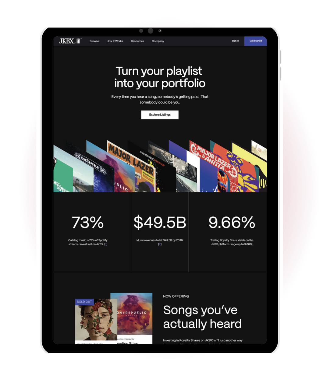
JKBX WEBSITE & PLATFORM
JKBX is an emerging trading platform that allows retail investors to buy shares of music royalties and trade them, just like any other security.
Challenge
As an early-stage startup, JKBX was struggling to identify their best-fit customers and how to position their offering accordingly. Their product, for many people, was simply too hard to understand.
Solution
As Product Marketing Manager, I was the crux between product, marketing, customer success, and communications teams. And I leveraged what I learned from those teams to craft simple, clear messaging that made investing in music rights relatable and appealing to young investors.

JKBX USER EDUCATION
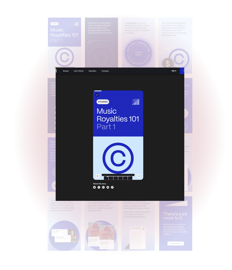
The JKBX platform sells assets that most investors aren’t familiar with — shares representing a specific portion of a royalty income stream.
Challenge
Early JKBX user research told us two things:
- Our target customer was likely a young, hungry investor who liked to learn using social media.
- They probably knew very little about how money flows in the music business.
Solution
I built an on-platform education content plan using carousel-style web stories. If users could flip through critical information in an engaging, short-form content format that felt similar to using Instagram or TikTok — without leaving the investment platform — we could upskill them more efficiently.
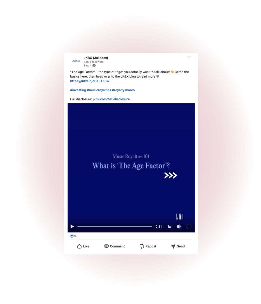
Or view a related education LinkedIn video.
SYMTERRA REBRAND
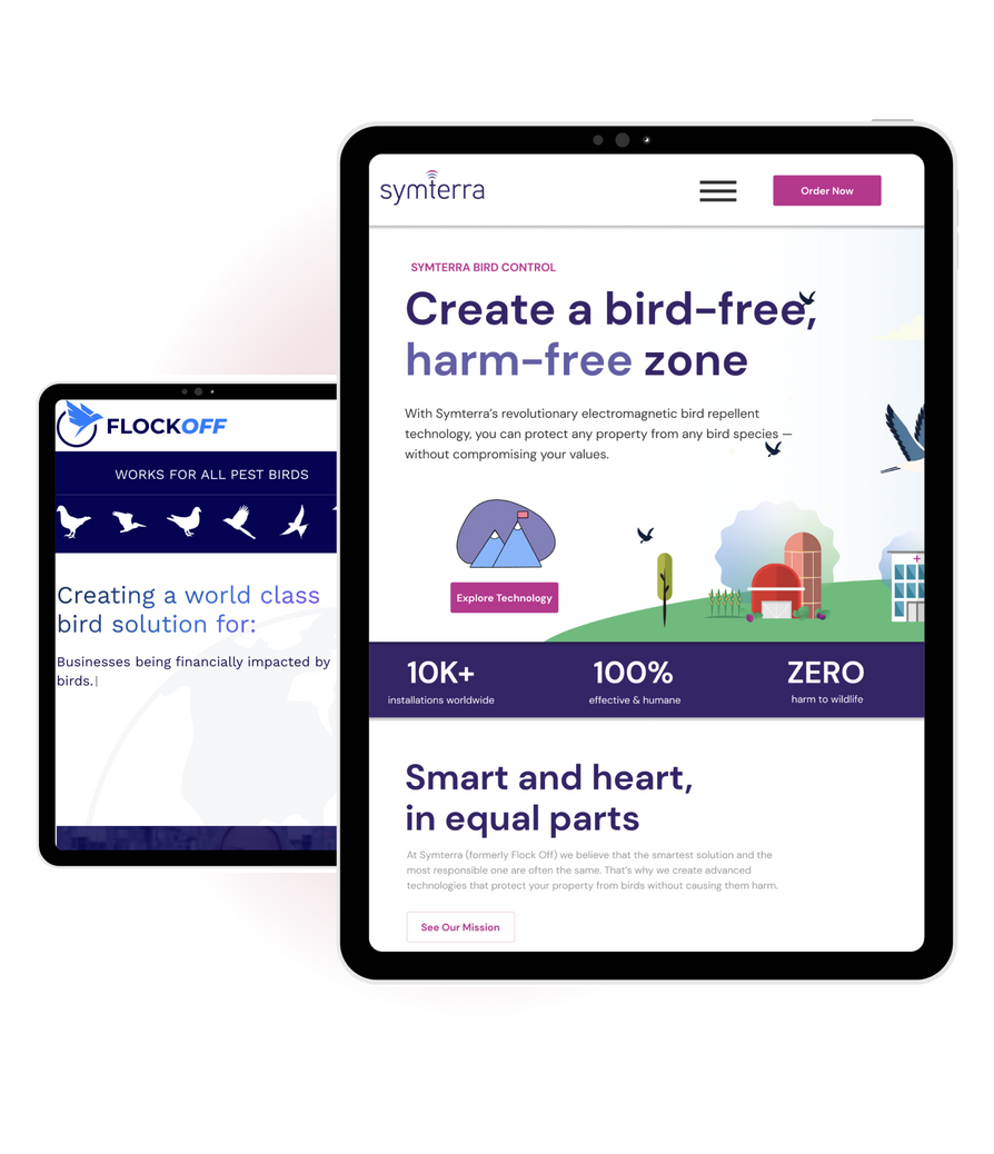
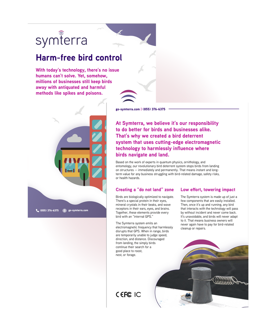
Flock Off, a growing provider of electromagnetic bird repellent technology, was looking to adopt a new brand personality that better reflected their values.
Challenge
The existing brand had several issues.
- Its flippant name was, while fun, misaligned with the ethos of their product, which is harmless by design.
- As a result, it didn’t appeal to their target audience — conscientious companies who want effective bird control with no ethical or moral costs.
- It had no defined brand voice, opting for heavy business-speak and often referring to birds as “pests” and “infestations.”
Solution
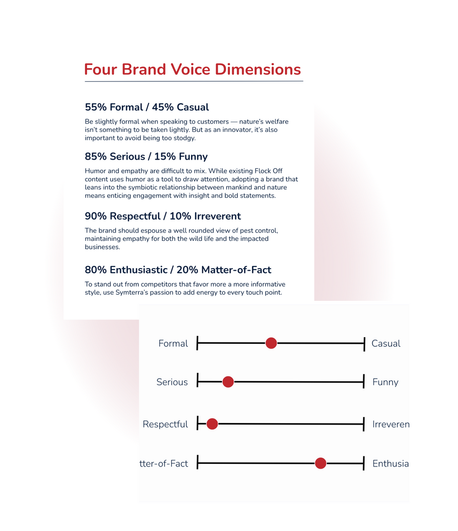
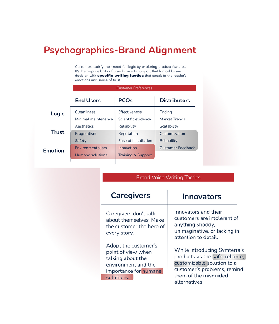
As part of a larger rebrand, including a new name, logo, and visual styles, I created a verbal identity better suited to their blend of caregiver and innovator brand attributes.
Using a blend of best-practice exercises and custom frameworks I developed myself, I crafted the blueprint for a specific and repeatable brand voice.
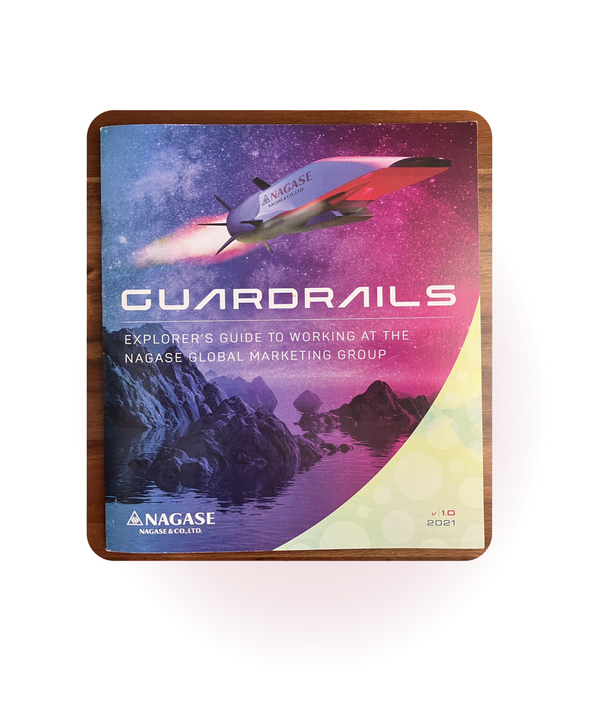
NAGASE MANIFESTO
In 2020, NAGASE established its first marketing team in its 188-year history as a company. That marketing team needed a strong culture to thrive.
Challenge
As a founding member of the Global Marketing Group (GMG), I was asked to write and direct creative for a team manifesto.
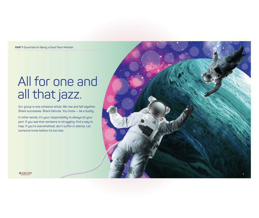
It was meant to describe and affirm the culture we were already building, capture the vision of our leadership, and act as an onboarding piece for new members while we scaled our office.
Solution
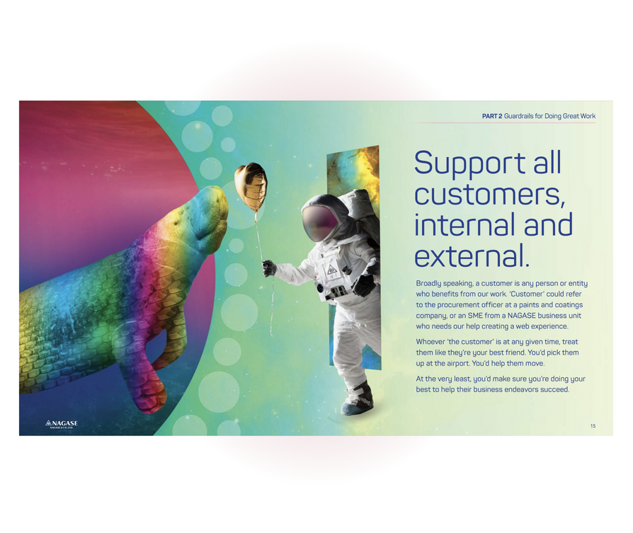
Visually, we landed on a blend of influences, including Japanese artwork (tying to our company’s roots), bright colors, and futuristic depictions of outer space.
Tonally, the writing is designed to embolden the reader and make them feel like they’re part of something huge and critical.
It was well received internally and used to inform how our HR system rewarded employees for adhering to our values.

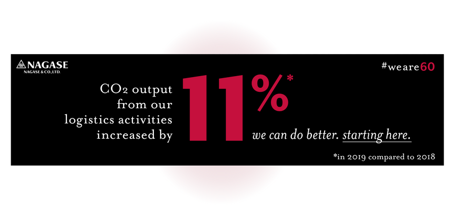
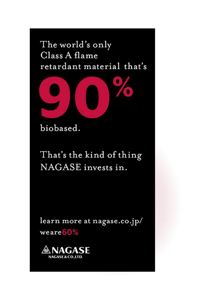
NAGASE “We ARE 60”
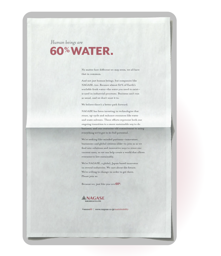
NAGASE had never made any significant effort to raise brand awareness. They wanted to change that by calling attention to their sustainability efforts.
Challenge
Chemical distributors don’t always have the best sustainability records. And coming out the gate with sustainability messaging, in general, isn’t always the best way to introduce new audiences to your company’s offering and your brand’s strengths.
Solution
Our concept, “We are 60” illustrated NAGASE’s vision for a sustainable future with a mix of print and digital advertising that did three things:
- Convey a sense of human unity around the issue.
- Accept responsibility for past ecological failures to stand out from greenwashing competitors.
- Highlight an active shift to manufacturing and distributing products that can and will make an impact.
A smattering of blogs & technical pieces

JKBX
I planned, researched, wrote, and published several articles about music royalties and alternative assets.
Infinite
I conducted technical research, interviewed SMEs, selected topics, and built out outlines for over a dozen 3D-printing related articles. I like this one:
Prinova
I wrote a handful of industry newsletters breaking down various trends in the food ingredients and supplements industry. Here’s an example:
NAGASE
I shepherded all case study content for NAGASE as part of a global site launch. I hashed out details with a team of experts to get this technical piece just right:
Airgas Thinks
I launched Airgas’ blog and oversaw content development. Some pieces I developed myself, including these three:
Some people call me space cowboy.
Okay, maybe they don’t.
But I have been called a lot of things. Because I do a lot to help the companies I work for communicate well.
I’m fun to talk to.
I promise.

Ring a ding-ding
Dan McBrearty
(610) 675-7004
helloitsdanmcbrearty@gmail.com